Question one:
'In what ways does your media product use, develop or challenge forms and conventions of real media products?'
Every genre of music video has its own codes and conventions; these expected and predictable signs are read by an audience which then allows them to differentiate between media texts and identify specific genres. There are four main types of form in which music videos can be categorised, these are: performance, narrative, animated and abstract.For my chosen brief, I have chosen the song “Going to Hell” by alternative/psychedelic rock band the Brian Jonestown Massacre who are signed to an independent record label. Therefore, as research to give me a greater understanding of the typical codes and conventions of the alternative genre and find inspiration for my own idea, I started off by researching the existing codes and conventions of the alternative music genre. I analysed a series of existing music videos in terms of their cinematography, representation of the artist(s), mise en scene and narrative content and drew influences that I would integrate into my own music video.
For alternative music, the most frequent and conventional form of video is a performance-related one which shows the band playing. However, whilst the cinematography used in such videos generally stays the same, the choice of mise en scene for many performance videos is always changing and quite often the band will be shown playing in an unusual location which makes the video memorable, e.g. Smells Like Teen Spirit by Nirvana in a school hall and Basket Case by Green Day which takes place in a mental asylum. The alternative rock genre stays dynamic because bands are always attempting to be more innovative with the use of location within their videos.
The technical codes used within the genre such as its camera techniques
serve to meet the audience expectations as they generally follow a set of
rules. A variety of camera shots within a performance or montage video can keep
it dynamic and interesting even if the performers are static. Within my chosen
genre, medium close up shots and close up shots are used the most prominently
as they show us and therefore allow us to identify the artists performing; this
also can create a sense of intimacy between the audience and the performer they
are viewing. Long shots are also used to capture the whole band in the shot and
such shots are used less frequently; often interweaving with the other medium
and close up shots. However, these camera techniques can differ between genres,
for example a long shot or wide shot may be used more prominently within a
video that features dancers as it allows us to experience it as a performance
spectacle. Close up shots of guitar strings or a guitar being strummed are also
quite common within the genre.
I completed audience research by developing an audience profile for the demographic of people who I felt are the intended target audience for the particular genre of music and who I would therefore try to make my product appeal to. After completing this initial research, I began my pre-production work which included storyboarding of ideas, developing a shot list and shooting schedule, and also consideration of appropriate locations.
I eventually decided that I was going to follow the conventions of the alternative music genre as opposed to challenging or working against them. These traditional conventions include wide, often fluid and dynamic shots of the band playing inter-cut with medium close up and close up shots of the singer who is given the representation as the leader and dominant figure within the band. I used a series of lip-syncing shots of the singer miming to the song which is a conventional feature of any performance based music video.


Within the video, I wanted to give a hyper-real ideological representation of the band by inter-cutting footage of them out and about outside of the performance to give this seemingly real impression of them as a band. This includes the band putting up posters to advertise their gig and rehearsing in the street and in a rehearsal space.
I put careful consideration into my choice of mise en scene as it needed to work favourably towards the representation of the band I was trying to get across. I wanted to include locations that were interesting or had some relevance to the bands lifestyle, for example I used an actual recording studio which showed us footage of the band setting up in a rehearsal situation. For the outside locations I decided that the Old Town, Marina and Cemetery would be the most suitable as it would provide a a more visually-stimulating mise en scene and would also provide us with minimal interruptions from the general public.
I noticed that in many influential band photographs, the band have been photographed in a fairly rundown or industrial locations. For example The Ramones debut album cover and the famous photo of The Smiths outside Salford Lads Club. This idea influenced me to use the exterior of an industrial factory building near my house which looked quite rundown. I photographed the location using my Kodak digital camera and when using the image within my ancillary texts, I added a black and white filter to add the moody feel to the image in the same way that it does in the examples.
A problem that I encountered after viewing the first draft on the edit suite was that the choice of mise en scene within some of the shots did not work in communicating the intended representation of the artists as a touring band. For example, a shot of the bass player in front of a waterfall was removed as a shopping centre could be seen in the background. I rectified these errors by using the industrial location to re-shoot some new shots for the video.


The song itself is alternative rock, however the band's genre is a mix of alternative rock and psychedelia. I therefore decided that it would be interesting to do a pastiche of typical 60's psychedelic album covers in which the band looks down at the camera which is on the floor looking up. When filming the shot I decided that I would then use it on one of the digipak covers and it would therefore appear to be a behind-the-scenes type of shot.
After the third draft there was still a significant amount of black screen with missing footage in the middle of the video. At this same time I realised that it would be effective to show the band rehearsing in a studio which I booked out. I then drew up a quick storyboard which showed the remaining shots that needed to be filmed; these would be a series of short shots of instruments being set up and plugged in along with a time lapse of the band setting up equipment which I would speed up in the edit suite.


I wanted to use a range of cinematography and was most successful in achieving this during a scene which I edited together to show the band setting up which I found to be a conventional feature of alternative music videos during the research stage. I used quick 1 second shots, including close up shots of instruments being plugged and amps switched on as well as a static wide shot that uses a time lapse to show the band setting up equipment in the studio.
For my digipak I started off with the back cover in which I manipulated the image above using Adobe Photoshop CS6 software to heavily blur all of the people in the picture to the point of being black silhouettes which I felt made for an interesting image as it adds a sense of mysteriousness to the band members and it also allowed for the text which I would then overplay to be more legible. After studying a series of real album sleeves, I added all of the features such as the barcode and mock-up institutional information that would feature on a real CD and positioned them appropriately to appear realistic.
For the front cover I wanted to create something that directly identified the genre of the band and used these conventional aspects of the psychedelic genre. I started off with an image that I took of a cat which was heavily edited using a series of different effects and given a psychedelic background pattern that blended into the image. This use of a bright colour scheme and patterns has the connotations of drug use and acid trips which is a feature traditionally associated with the genre and would be recognised by the audience. I then used a red and yellow colour scheme to add the name of the band and album over the top of the image; this text was then warped which is an idea that I borrowed from some of the psychedelic album covers and posters that I studied during research.
When researching the inner sleeves of digipaks, I noticed that there are often photos of the band inside, quite often a series of small images together to form a montage. I decided that I would apply this technique within my own gate-fold sleeve. I looked through the video and selected shots of the band members with their instruments and shots of the instruments themselves which I then took from the video and re-sized them accordingly, therefore not losing image quality. I changed the colouring on many of the images to black and white so as to stick to the inner colour scheme of black.
For the magazine advertisement, I constructed a deliberate pastiche of psychedelic concert posters which conventionally feature bright colouring and warped text. I copied these features for the creation of my advertisement whilst still using the conventions. I started with an image of a 60's model which I then posterised and changed the colouring on Photoshop. I decided on a psychedelic-style colour scheme of orange, pink and green and created text in these colours which I then warped to wrap around the image. I added a small thumbnail image of the album cover itself with a 5 star review from a reputable magazine on the advertisement as is typical of the form.
Question two:
'How effective is the combination of your main product and ancillary texts?'
In my audience questionnaire I will gather some outside feedback to this question, however I am overall quite pleased with the combination of my main music video and accompanying ancillary texts which are a digipak for the band's album and a magazine advert. Similarly to the marketing of a real artist or product, I have demonstrated the use of cross-form synergy by marketing the band across a variety of different forms; for example: DVD (music video), CD's (digipak) and print (magazine advert).
When creating the digipak, I wanted it to reinforce the representation of a touring band that I was trying to market towards its target audience of psychedelic music fans; I achieved this by extracting still images from the music video itself and shrinking them for use on the inner gatefold sleeve of the digipak.


I feel that I have been quite successful in carrying the psychedelic theme across my different media forms by using the conventional aspects and semiotic signs that identify the audience with the genre. However, due to my personal preference to create a performance-related video as opposed to an abstract one, as abstract videos are the more conventional form of video for a psychedelic song, the music video reflects the genre less directly. Nevertheless, I used the low angle shot of the band looking down on the camera as a pastiche of this typical band photograph style that was quite frequently seen in the 60's.
When creating the digipak, I wanted it to reinforce the representation of a touring band that I was trying to market towards its target audience of psychedelic music fans; I achieved this by extracting still images from the music video itself and shrinking them for use on the inner gatefold sleeve of the digipak.


 |
| An example of a low angle band shot |
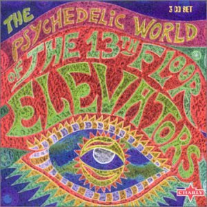 |
| An example of a psychedelic album cover |
For the ancillary texts I wanted to identify with the genre much more directly and create a pastiche through use of the recognisable codes and conventions. For example on both my album front cover and magazine advert I used warped lettering styles and a bright contrasting colour scheme to achieve this. On my magazine advert I have actually included a small thumbnail of the album cover with an accompanying five star review which shows further use of cross-form synergy within my ancillary texts.
For the name of the album I used the title "Juxtapose This". The word Juxtaposition has the definition of contrasting elements and I therefore made the conscious decision to use different colours for both words within the title which shows understanding of the definition itself and is a subtle attempt at irony.
After completing the digipak, I put them into context by attaching the images onto a realistic 3D template which then showed how the digipak would appear to the audience. In order to achieve this, I had to warp the proportions of the images using Adobe Photoshop CS6's warp tool and scale them down to the correct size in order for them to fit onto the template.
However, as specified in the audience feedback section, the music video relates more directly with the alternative genre whilst the ancillary texts relate more with the psychedelic genre through the use of the semiotics and codes and conventions. Though these creative choices were deliberate, I realised that the combination of the two could have been much more effective if the music video had been constructed in a way that signifed the genre more clearly.
Question three:
'What have you learned from your audience feedback?'
I decided to film a series of video interviews with individuals who fell into both categories of my quite broad audience demographic. As expressed in my audience profile, the target audience for the band's music can be categorised into an older demographic of people who may have been exposed to 60s music or are just fans of it (both males and females aged 25-50) and a younger demographic who may have been exposed to or discovered the bands music through other means (males and females aged 16-25). I made the deliberate choice to interview individuals that weren't in the music video in order to get an unbiased opinion.
From the feedback that I received both positive and critical feedback. I discovered that the audience enjoyed the music video overall and felt that it succeeded in using many of the technical codes and conventions that alternative performance videos use, such as the wide tracking shots of the band playing. When asked about the effectiveness of the video and ancillary texts combination, many felt that the use of smaller tiled video stills within the inner sleeve were a good idea as they showed relation to the video itself.
Feedback for the ancillary texts was positive as the audience recognised the 60s psychedelia influence on both the digipak and poster which was the intended reponse as the band themselves are a 60s revivalist band. The audience felt that the colour scheme was bright, attractive and eye-catching. In addition to this, some of the audience mentioned that the band themself appear to be real rather than just a construction.
Some of the more critical points that were discussed were that there could've perhaps been a clearer relation between the music video itself and the ancillary texts as the video focused less on the conventions of psychedelic which is mostly abstract; this is due to my choice to create a performance video. Another critical point that was mentioned was that many of the shots within the video lasted too long or weren't particularly interesting.
After taking this feedback into consideration I have decided that if I were to repeat the process in the future I would consider showing relation to the psychedelic influence of the band more clearly by using more abstract cinematography techniques and, more specifically, experimented more with some of the editing techniques and effects that could've been used. I would also have used a projector for the footage that was shot in the theatre. Due to the high demand for the theatre and the lateness of the original camera operator, much of the footage shot in the theatre could've been re-shot and improved but unfortunately, due to availability issues, this was not able to be done; however this is something that could be improved upon if I were to repeat the process.
I would also change many of the shots within the video as I felt that some were not quite as effective as others. An example of this would be the final shot of the singer disappearing under a bridge which is too lengthy and could be cut down and perhaps replaced with a few others shots as the audience may start to lose interest.
TO BE COMPLETED
Question four:
'How did you use new media technologies in the construction and research, planning and evaluation stages?'
The use of digital media technologies within all stages of creation from pre through to post-production proved to be vital. After setting up my online blog which would serve as the output for all of my work, I encouraged audience feedback from a small ranged demographic of people in which I gathered psychographic information such as age, location and gender and also what type of videos they enjoy. This audience feedback gave me a clearer idea of the target audience for my product and who my music video would appeal to. I gathered this audience feedback through the form of an online questionnaire which I integrated into my blog and encouraged feedback through the social networking site Facebook; the reason for this is due to the relevance of the internet on today's society and the ease of access that it provided.
I then continued to assemble ideas for my music video whilst researching into the codes and conventions of the genre. After completing a storyboard for the video I used a digital scanner to scan the different frames onto the PC and then created an animatic using Windows Movie Maker software which used the drawn frames from the storyboard to show roughly how the video would look by using similar shot durations to how they would be in the final video and editing them in time with the music.
When all of the pre-production work and planning was complete, which included storyboarding, shot lists, shooting schedules and location and prop lists, the video was ready to be filmed. After careful consideration of appropriate mise en scene for the video that would reflect the intended ideological representation of a touring band that I wanted to achieve, I realised it would not be possible to film all of the footage in one day; in addition to this I had to carefully arrange my shooting schedule around the availability of the actors.
For the filming of my music video I used a Sony Handycam HDR-CX115E video recorder with tripod to capture all of the footage. When all of the footage was captured I transferred the footage onto an editing suite where I used Adobe Premiere Pro software to edit the video together and add any transitions. I made the creative decision not to use any effects during the editing process, the reason for this being that despite the bands genre being psychedelic/alternative, the song that I had chosen was one of the lesser psychedelic sounding songs and I felt that an abstract form of video wouldn't be suitable. I used simple cuts when editing the footage together and a fade in at the beginning of the video as well as a fade out to black at the end. I did not want to draw the audiences attention away from the video itself by using stylistic transitions as I felt that they were not necessary. I used the time stretch tool to create some time lapses of the band setting up their equipment, of which the original shot was between 5-1- minutes before being sped up. When the final edit of the music video was finished I uploaded it to the popular video-sharing website Youtube so that it could be viewed easily by the target audience.
When researching existing album sleeve designs for my ancillary texts I used the online resource http://www.cdcovers.cc/ which allowed to me to search a wide database of album covers where I could access jpeg images of both the inner and outer sleeve designs. This proved to be very helpful in addition to looking through my own personal CD collection for inspiration.
I used primarily Adobe Photoshop CS6 photo-editing software to construct my ancillary texts to a near professional standard. This allowed me to manipulate my images by posterising them and changing the colour levels to suit the psychedelic theme. For the text I used the 'hobo' font and then the warp tool to achieve the lettering style which I kept consistent throughout all of the ancillary texts. For the back sleeve I used the blur tool to achieve the black silhouette effect of the band which I then placed the white text over so that it could be easily read.


When designing the CD design itself I looked through my own collection to see which features I would need to include and get a better idea about the design layout of existing products. I used google images to find the compact disc logo which I applied to my CD design to make it appear more realistic in addition to a barcode which I applied to the bottom right hand corner of the back sleeve.
Finally, I used my kodak digital camera's video function to gather the audience feedback for my product from a selected demographic of younger people aged 17-21 in which I asked a series of prepared questions about the overall effectiveness of my product and the aspects that they enjoyed or didn't enjoy in order to see which parts were more successful and what I would change if I were to do it again. I then uploaded the videos to my PC where I have integrated them into my online blog during the evaluation stage.


